Unassigned Calendar CSS to change color
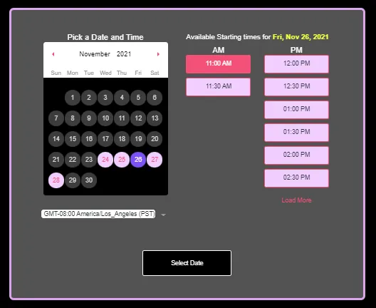
DARK THEME
<script>var style = document.createElement('style');
style.innerHTML = `
/* calendar Section Box Shadow */
#hl_widget > div {
-webkit-box-shadow: 0px 0px 22px 0px rgba(0, 0, 0, 0.10) !important;
-moz-box-shadow: 0px 0px 22px 0px rgba(0, 0, 0, 0.10) !important;
box-shadow: 0px 0px 22px 0px rgba(0, 0, 0, 0.10) !important;
padding: 30px !important;
border-radius: 10px 10px 10px 10px;
-moz-border-radius: 10px 10px 10px 10px;
-webkit-border-radius: 10px 10px 10px 10px;
border: 5px solid #dda4f0;
margin-top: 20px;
}
.hl-app .white-bg{
background-color: #fff0;
}
/* calendar Section Box Shadow */
/* calendar border */
#hl_widget > div > div.hl_widget-body > div > div > div > div > div.hl_widget--pick-date > div.vdpComponent.date-picker-calendar > div,
#hl_widget > div > div.hl_widget-body > div > div > div > div > div.hl_widget--pick-date > div.vdpComponent.date-picker-calendar > div > div {
-webkit-box-shadow: 0px 0px 1px 0px #f45177;
-moz-box-shadow: 0px 0px 1px 0px #f45177;
box-shadow: 0px 0px 1px 0px #f45177;
border-radius: 5px !important;
}
/* calendar border */
/* calendar date and hover color */
.vdpCell.selected .vdpCellContent {
color: #fff !important;
background: #f45177!important;
}
.vdpCell.selected .vdpCellContent:hover {
color: #fff !important;
background: #f45177!important;
}
.selectable .vdpCellContent {
color: #f45177!important;
border-radius: 50% !important;
font-weight: 500 !important;
}
.vdpCell.selectable:hover .vdpCellContent {
color: #fff !important;
background: #f45177!important;
}
/* calendar date and hover color */
/* Select Date Button color */
#hl_widget > div > div.hl_widget-footer > button {
border-color: #fff!important;
background-color: #000!important;
color: #fff !important;
}
/* Select Date Button color */
/* Time Active color , Hover Color , Border Color */
.hl-app .hl_widget-step1 .hour-select input:checked + label {
background-color: #f45177!important;
border-color: #f45177!important;
color: #fff !important;
}
.hl-app a {
color: #f45177!important;
}
.hl-app .hl_button.--primary {
border-color: #f45177!important;
background-color: #f45177!important;
color: #fff;
}
.hl-app .hl_widget-step1 .hour-select label {
display: block;
cursor: pointer;
-webkit-transition: all .2s ease-in-out;
transition: all .2s ease-in-out;
padding: 7px 20px;
border: 1px solid #f45177!important;
border-radius: 4px;
max-width: 150px;
margin: 0 auto;
font-weight: 500;
background: #f1ceff;
}
.hl-app .hl_widget-step1 .hour-select label:hover {
color: #fff !important;
background-color: #000!important;
}
/* Time Active color , Hover Color , Border Color */
/* calander Arrow Color */
.vdpArrowNext::after {
margin-left: -.5em;
border-left-color: #f45177!important;
}
.vdpArrowPrev::after
margin-left: -.8em;
border-right-color: #f45177!important;
}
.hl-app .hl_widget-inner{
background: #535353;
}
.hl-app .hl_widget-step1 h3{
color: #fff;
}
.hl-app .hl_widget-step1 .hl_widget--pick-hours h3 strong {
color: #f0ff40;
}
.hl-app .hl_widget-step1 .hl_widget--pick-hours h3{
color: #fff;
}
.hl-app .hl_widget-step1 .pick-hours--wrap h4{
color: #fff;
}
.hl-app .hl_widget-step1 p {
font-size: 14px;
color: azure;
}
.vdpInnerWrap{
background: #000;
}
.disabled .vdpCellContent {
color: #ddd!important;
background: #3c3c3c!important;
}
.selectable .vdpCellContent {
color: #f45177!important;
border-radius: 50% !important;
font-weight: 500 !important;
background: #f1ceff;
}
.vdpCell.selected .vdpCellContent {
color: #fff !important;
background: #7c51f4!important;
}
/* calander Arrow Color */
/* For mobile Select Time color */
@media only screen and (max-width: 649px) {
.hl-app .--primary {
border-color: #f45177!important;
background-color: #f45177!important;
color: #fff;
}
}
/* For mobile Select Time color */
`;
document.head.appendChild(style);
</script>
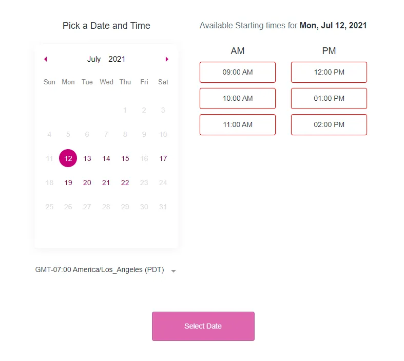
LIGHT THEME
<script>var style = document.createElement('style');
style.innerHTML = `
/* calendar Section Box Shadow */
#hl_widget > div {
-webkit-box-shadow: 0px 0px 22px 0px rgba(0, 0, 0, 0.10) !important;
-moz-box-shadow: 0px 0px 22px 0px rgba(0, 0, 0, 0.10) !important;
box-shadow: 0px 0px 22px 0px rgba(0, 0, 0, 0.10) !important;
padding: 30px !important;
border-radius: 10px 10px 10px 10px;
-moz-border-radius: 10px 10px 10px 10px;
-webkit-border-radius: 10px 10px 10px 10px;
border: 0px solid #c90079;
}
/* calendar Section Box Shadow */
/* calendar border */
#hl_widget > div > div.hl_widget-body > div > div > div > div > div.hl_widget--pick-date > div.vdpComponent.date-picker-calendar > div,
#hl_widget > div > div.hl_widget-body > div > div > div > div > div.hl_widget--pick-date > div.vdpComponent.date-picker-calendar > div > div {
-webkit-box-shadow: 0px 0px 1px 0px #00d1b9;
-moz-box-shadow: 0px 0px 1px 0px #00d1b9;
box-shadow: 0px 0px 1px 0px #00d1b9;
border-radius: 5px !important;
}
/* calendar border */
/* calendar date and hover color */
.vdpCell.selected .vdpCellContent {
color: #fff !important;
background: #c90079!important;
}
.vdpCell.selected .vdpCellContent:hover {
color: #fff !important;
background: #c90079!important;
}
.selectable .vdpCellContent {
color: #7b0046!important;
border-radius: 50% !important;
font-weight: 500 !important;
}
.vdpCell.selectable:hover .vdpCellContent {
color: #fff !important;
background: #c90079!important;
}
/* calendar date and hover color */
/* Select Date Button color */
#hl_widget > div > div.hl_widget-footer > button {
border-color: #7b0046!important;
background-color: #c90079!important;
color: #fff !important;
}
/* Select Date Button color */
/* Time Active color , Hover Color , Border Color */
.hl-app .hl_widget-step1 .hour-select input:checked + label {
background-color: #c90079!important;
border-color: #c90079!important;
color: #fff !important;
}
.hl-app a {
color: #2a2a2a !important;
}
.hl-app .hl_button.--primary {
border-color: #ff0000!important;
background-color: #ff0000!important;
color: #fff;
}
.hl-app .hl_widget-step1 .hour-select label {
display: block;
cursor: pointer;
-webkit-transition: all .2s ease-in-out;
transition: all .2s ease-in-out;
padding: 7px 20px;
border: 1px solid #ff0000!important;
border-radius: 4px;
max-width: 150px;
margin: 0 auto;
font-weight: 500;
}
.hl-app .hl_widget-step1 .hour-select label:hover {
color: #fff !important;
background-color: #c90079!important;
}
/* Time Active color , Hover Color , Border Color */
/* calander Arrow Color */
.vdpArrowNext::after {
margin-left: -.5em;
border-left-color: #c90079!important;
}
.vdpArrowPrev::after {
margin-left: -.8em;
border-right-color: #c90079!important;
}
/* calander Arrow Color */
/* For mobile Select Time color */
@media only screen and (max-width: 649px) {
.hl-app .--primary {
border-color: #ff0000!important;
background-color: #ff0000!important;
color: #fff;
}
}
/* For mobile Select Time color */
`;
document.head.appendChild(style);
</script>
Footnote
You can change the color to the color of your choice by changing the hex code that has been bolded to help you edit.
NOTE
Copy and paste the code for your custom calendar
In order to change calendar color
change the hex code in the CSS to your color of choice
*hex color has been made bold in the code so you can change it easily
Team Calendar CSS to change color

CSS code: Apply this in the team calendar CSS box in step 3 of TEAM calendar setup
<style >
:root {
--primaryColor: #45046C;
--lightColor: #FFBC44;
--primaryFont: "poppins";
}
.appointment_widgets--booking .appointment_widgets--steps .widgets-date-block .vdpCell.selectable.selected .vdpCellContent,
.appointment_widgets--booking .appointment_widgets--steps .widgets-date-block .vdpCell.selectable .vdpCellContent:hover {
background: var(--primaryColor) !important;
color: #fff !important;
}
.appointment_widgets--booking .appointment_widgets--steps .widgets-date-block .vdpCell .vdpCellContent {
border: 1px solid var(--lightColor);
color: var(--primaryColor) !important;
cursor: pointer;
margin: 0;
background: var(--lightColor);
}
.appointment_widgets--booking .appointment_widgets--steps .widgets-slot-block .widgets-time-slots .widgets-time-slot > span {
border: 1px solid var(--primaryColor) !important;
color: var(--primaryColor) !important;
font-weight: 700;
cursor: pointer;
transition: all .3s ease;
width: 100%;
}
.appointment_widgets--booking .appointment_widgets--steps .widgets-slot-block .widgets-time-slots .widgets-time-slot > span:hover {
border: 2px solid #d3ac00 !important;
}
.appointment_widgets--booking .appointment_widgets--steps .widgets-slot-block .widgets-time-slots .widgets-time-slot.actived > span {
background: #c2c2c2!important;
color: #fff !important;
}
button.arrowPrevious svg rect,
button.arrowNext svg rect {
stroke: var(--primaryColor) !important;
}
button.arrowPrevious svg path,
button.arrowNext svg path {
fill: var(--primaryColor) !important;
}
.appointment_widgets--booking .widgets-action-buttons .widgets-action button {
background: #FFBC44!important;
}
.appointment_widgets--booking .widgets-action-buttons .action-back-link {
color: var(--primaryColor) !important;
}
footer a.action-back-link svg path {
fill: var(--primaryColor) !important;
}
.appointment_widgets--booking .appointment_widgets--steps .widgets-date-block .vdpCell.today .vdpCellContent:after {
color: var(--primaryColor) !important;
}
.appointment_widgets--booking .appointment_widgets--steps .widgets-date-block .vdpCell.today .vdpCellContent:after {
color: var(--primaryColor) !important;
}
.appointment_widgets--booking {
font-family: var(--primaryFont);
}
.appointment_widgets--info {
display: flex !important;
}
.appointment_widgets--booking .appointment_widgets--info {
justify-content: flex-start !important;
}
.appointment_widgets--booking .appointment_widgets--steps {
flex: 0 0 66% !important;
max-width: 66% !important;
padding-top: 1.5rem;
}
#appointment_widgets > div > div > div.appointment_widgets--services > div > div {
border: 2px solid #000 !important;
box-shadow: 0px 0px 20px #00000020 !important;
border-radius: 5px !important;
}
/*
.appointment_widgets {
max-width: 850px !important;
margin: 0 auto !important;
}
*/
@media only screen and (max-width: 765px) {
.appointment_widgets--booking .appointment_widgets--steps {
flex: 0 0 100% !important;
max-width: 100% !important;
}
}
@media only screen and (max-width: 765px) {
.appointment_widgets--info {
display: flex !important;
}
.appointment_widgets--info {
display: flex !important;
}
.appointment_widgets {primary-color: #8340ff !important;}
.hl-app .hl_button,
.appointment_widgets--booking .appointment_widgets--steps .widgets-slot-block .widgets-time-slots .widgets-time-slot.actived button {
background: var(--primaryColor) !important;
background: var(--primaryColor) !important;
color: #fff;
border-color: #FFBC44!important;
border-color: #9a0165 !important;
}
}
</style >

Powered by Omni Matic

