CSS codes for Forms
Codes have been provided down below
CSS form styling 1
CSS form styling 2
CSS form styling 3
CSS form styling 4
CSS form styling 5
CSS form styling 6
CSS form styling 7
CSS form styling 8
CSS form styling 8
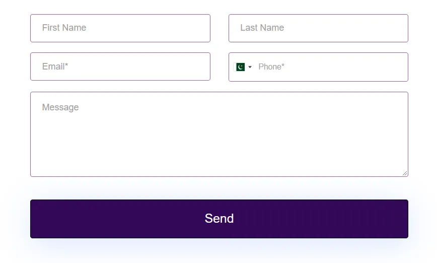
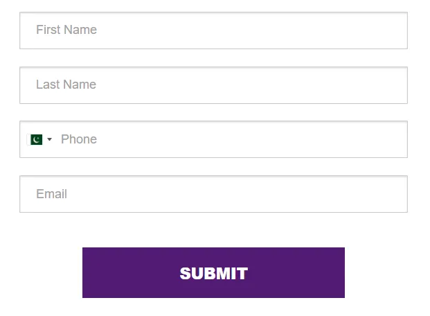
Form 1 CSS
textarea.form-control {
min-height: 150px!important;
}
button.btn.btn-dark {
padding: 14px 30px !important;
}
.form-control {background:#fff;
font-size: 16px; font-weight: normal;
border: 1px solid rgba(120,25,120,0.7);
border-radius: 4px; height: 50px; margin: 0;}
.form-control:focus{
border: 2px solid rgba(155,155,25,0.4);}
.btn {
width: 100%!important;
margin-top: 22px;
text-transform: capitalize; font-size:22px;
font-family: 'Montserrat', sans-serif;
font-weight: 400;
box-shadow: 1px 9px 57px rgba(76, 139, 245, 0.23)
}
.btn:hover {background-color: #ffccee!important;}
.iti--allow-dropdown input{ background:#fff;
padding-right: 6px;
padding-left: 52px;
margin-left: 0;
border: 1px solid rgba(120,25,120,0.7);
border-radius: 4px!important;
}
.iti--allow-dropdown input:focus{
border: 1px solid rgba(20,125,120,0.7);
}
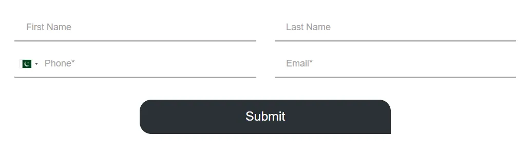
Form 2 CSS
.form-control , .vdpComponent.vdpWithInput>input {
background:#fafafa!important;
border: 1px solid #c2c2c2;
font-size: 12px;
font-weight: normal;
border-radius: 2px;
height: 40px; margin: 0;}
.btn {
border-radius: 1px!important;
width: 20%!important;
margin-top: 5px;
text-transform: capitalize; font-size:18px;
font-family:'Poppins', sans-serif;
font-weight: 400;
border-bottom-right-radius:
0px!important;
}
textarea.form-control {
min-height: 80px!important;
}
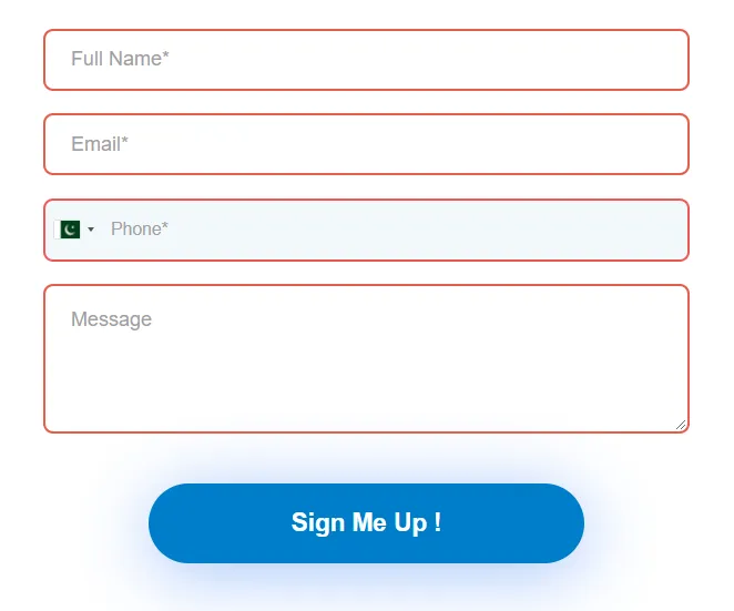
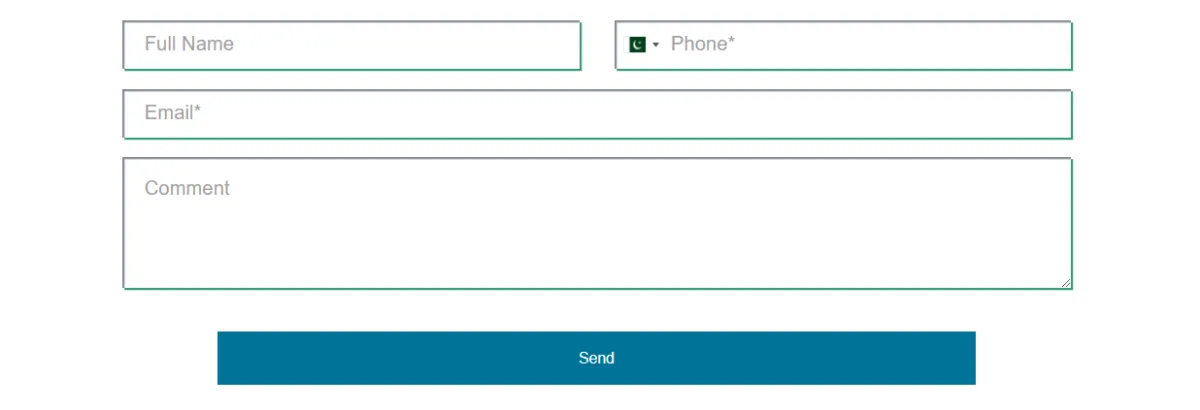
Form 3 CSS
textarea.form-control {
min-height: 120px!important;
}
button.btn.btn-dark {
padding: 14px 30px !important;
}
.form-control {background:#fff;
font-size: 16px; font-weight: normal;
border: 2px solid rgba(220,25,0,0.7);
border-radius: 8px; height: 50px; margin: 0;}
.form-control:focus{
border: 2px solid rgba(255,155,25,0.4);}
.btn {
width: 67.5%!important;
margin-top: 22px;
text-transform: capitalize; font-size:20px;
font-family: 'Montserrat', sans-serif;
font-weight: 600;
box-shadow: 1px 9px 57px rgba(76, 139, 245, 0.53)
}
.btn:hover {background-color: #2D45A5!important;}
.iti--allow-dropdown input{
padding-right: 6px;
padding-left: 52px;
margin-left: 0;
border: 2px solid #f05757;
border-radius: 8px!important;
}
.iti--allow-dropdown input:focus{
border: 2px solid rgba(255,155,25,0.4);
}
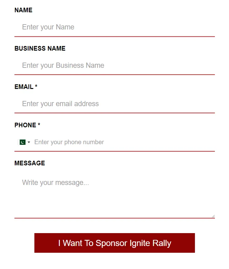
Form 4 CSS
.form-control {
background:#fff!important;
box-shadow: inset 2px 2px 1px rgba(240,170,170,1), 2px 2px rgba(120,00,100,1) !important;
font-size: 18px;
font-weight: normal;
border-radius: 0px;
height: 45px; margin: 0;}
.btn {
border-radius: px!important;
width: 80%!important;
margin-top: 16px;
text-transform: capitalize; font-size:22px;
font-family:'Poppins', sans-serif;
font-weight: 400;
border-bottom-right-radius:
0px!important;
}
.btn:hover {opacity: 0.9;}
textarea.form-control {
min-height: 120px!important;
}
.vdpComponent.vdpWithInput>input, .iti--allow-dropdown input
{
background:#fff!important;
box-shadow: inset 2px 2px 1px rgba(240,170,170,1), 2px 2px rgba(120,0,100,1) !important;
font-size: 12px;
font-weight: normal;
border-radius: 0px;
height: 45px; margin: 0;}
.form-builder--item label {
font-size: 1rem;
color: #2a3135;
font-weight: bold;
}
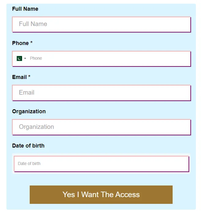
Form 5 CSS
label{color:#000000!important; display: none;}
.form-control {background:#fff;box-shadow: inset 0 1px 2px rgba(130,137,150,0.33),0 1px 0 rgba(255,255,255,0.95) !important; font-size: 16px; font-weight: normal;
border: 1px solid rgba(0,0,0,0.2);
border-radius: 1px; height: 48px; margin: 0;}
.form-builder--item {margin: 10px;
}
.btn {
text-transform: capitalize; font-size:20px;
font-family: Poppins,Helvetica, sans-serif;
font-weight: 900;
width: 67.5%!important;
margin-top: 22px
}
.vdpComponent.vdpWithInput>input, .iti--allow-dropdown input
{background:#fff;box-shadow: inset 0 1px 2px rgba(130,137,150,0.33),0 1px 0 rgba(255,255,255,0.95) !important; font-size: 16px; font-weight: normal;
border: 1px solid rgba(0,0,0,0.2);
border-radius: 1px; height: 48px; margin: 0;
}
.form-builder--item {margin: 10px;
}
.form-control {
background:
#fff!important;
font-color: #202020!important;
font-family: Poppins, Helvertica, sans-serif;}
.btn:hover {opacity: 0.9;
}
Form 6 CSS
.form-control {background:#fff;
box-shadow: inset 0px 0px 0px rgba(130,137,150,0),0px 2px 0 rgba(155,155,155,0.95) !important; font-size: 16px; font-weight: normal;
border: 0px solid rgba(0,0,0,0.2);
border-radius: 1px; height: 45px; margin: 0;}
.btn {
border-radius: 20px!important;
width: 50%!important;
margin-top: 22px;
text-transform: capitalize; font-size:22px;
font-family:'Poppins', sans-serif;
font-weight: 400;
border-bottom-right-radius:
0px!important;
}
.btn:hover {opacity: 0.9;}
textarea.form-control {
min-height: 120px!important;
}
.iti--allow-dropdown input
{background:#fff;
box-shadow: inset 0px 0px 0px rgba(130,137,150,0),0px 2px 0 rgba(155,155,155,0.95) !important; font-size: 16px; font-weight: normal;
border: 0px solid rgba(0,0,0,0.2);
border-radius: 1px; height: 45px; margin: 0;}
Form 7 CSS + (special burron effect)
.form-control {
background:#fff!important;
box-shadow: inset 2px 2px 1px rgba(130,137,150,1), 2px 2px rgba(55,155,125,1) !important;
font-size: 18px;
font-weight: normal;
border-radius: 0px;
height: 45px; margin: 0;}
.btn {
border-radius: px!important;
width: 80%!important;
margin-top: 22px;
text-transform: capitalize; font-size:22px;
font-family:'Poppins', sans-serif;
font-weight: 400;
border-bottom-right-radius:
0px!important;
}
.btn:hover {opacity: 0.9;}
textarea.form-control {
min-height: 120px!important;
}
.vdpComponent.vdpWithInput>input, .iti--allow-dropdown input
{
background:#fff!important;
box-shadow: inset 2px 2px 1px rgba(130,137,150,1), 2px 2px rgba(55,155,125,1) !important;
font-size: 18px;
font-weight: normal;
border-radius: 0px;
height: 45px; margin: 0;}
.form-builder--item label {
font-size: 1rem;
color: #2a3135;
font-weight: bold;
}
.btn{
color: #fff;
font-family: 'Roboto Condensed', sans-serif;
font-size: 14px;
font-weight: 400;
text-transform: capitalize;
letter-spacing: 0px;
border: 1px solid #00d8d6;
overflow: hidden;
position: relative;
z-index: 1;
transition: all 0.5s;
}
.btn:hover{
color: #fff;
animation: swoosh 0.4s ease-out 0.2s;
}
.btn:before,
.btn:after{
content: "";
background-color: #00d8d6;
height: 100%;
width: 100%;
opacity: 0.7;
position: absolute;
top: 0;
left: -100%;
z-index: -1;
transition: all 0.4s ease-out 0.1s;
}
.btn:after{
opacity: 0;
transform: scale(0.9,0.7);
left: 0;
transition: all 0.3s ease-out 0s;
}
.btn:hover:before{ left: 100%; }
.btn:hover:after{
opacity: 0.3;
transform: scale(1);
}
@keyframes swoosh{
0%,100%{ box-shadow: 0 0 0 0 transparent; }
50%{ box-shadow: 0 0 0 8px rgba(0,214,216,0.3); }
}
Form 8 CSS
.form-control {
background:#fff!important;
box-shadow: inset 0px 2px 0px rgba(130,137,150,0),0px 2px rgba(185,55,55,0.95) !important;
font-size: 18px;
font-weight: normal;
border-radius: 0px;
height: 45px; margin: 0;
}
.btn {
width: 80%!important;
margin-top: 22px;
text-transform: capitalize; font-size:22px;
font-family: 'Montserrat', sans-serif;
font-weight: 400;}
.btn: hover {opacity: 0.9;
}
textarea.form-control {
min-height: 120px!important;
}
.iti--allow-dropdown input
{background:#fff;
box-shadow: inset 0px 0px 0px rgba(130,137,150,0),0px 2px 0 rgba(185,55,55,0.95) !important; font-size: 16px; font-weight: normal;
border: 0px solid rgba(0,0,0,0.2);
border-radius: 0px; height: 45px; margin: 0;}
.form-builder--item label {
font-size: 1rem;
color: #2a3135;
font-weight: bold;
}
element.style {
background-color: #FFFFFFFF;
color: #000000;
border: 3px solid#c0104f;
border-radius: 0px;
max-width: 550px;
}

Powered by Omni Matic

